The classic appeal of a Mid-century modern kitchen comes from a simple promise: beauty that works. Clean lines, flat-panel wood cabinetry, and honest materials create a look that feels both fresh and lived-in.
Expect practical layouts that prioritize storage, flow, and clear sightlines. Exposed beams, teak or walnut tones, and quartz counters add warmth and resilience without clutter.
This introduction previews a listicle that moves from defining elements to finishes, color choices, cabinetry moves, and lighting concepts you can apply to your own space. You will see how color ranges from grounded earth tones to bold primaries, and why materials like slate, bronze, and textured woods remain smart, low-maintenance picks.
The approach scales to any layout — from compact galley plans to open-plan homes — by focusing on proportion, storage, and rhythmic details that support lasting style and function.
Key Takeaways
- A Mid-century modern kitchen pairs function with streamlined form.
- Flat-panel cabinets and honest materials drive effective kitchen design.
- Wood tones and bold accents offer versatile color options.
- Durable surfaces like quartz and slate fit the style and daily life.
- Design moves translate across small and large spaces.
What defines a mid-century modern kitchen: clean lines, function-first design
A true mid century ethos in the kitchen focuses on tidy silhouettes and everyday usefulness. This approach pairs clean lines with layouts that prioritize work zones, storage, and durable surfaces.
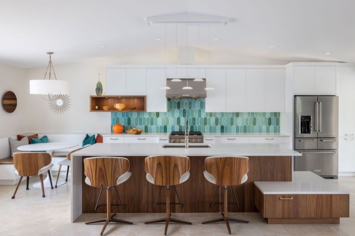
Core elements include flat-panel cabinetry, geometric motifs in tile or textiles, and sculptural seating that adds organic curves against rectilinear forms. Quartz counters and mixed materials—wood, stone, and metal—bring warmth and durability.
Core elements: flat-panel cabinetry, geometric patterns, and sculptural seating
Hidden or paneled appliances and integrated pulls reduce visual noise and help workflows at the range, sink, and prep areas. Geometric backsplashes and rhythmic wood grain add pattern without cluttering the visual field.
Balancing form and function in modern kitchen design
Open planning with clear traffic paths, targeted lighting, and smart storage—drawer organizers, tray dividers, and pantry pullouts—keeps counters clear and the space calm.
Choose finishes that age well so the look supports family meals and entertaining. Thoughtful materials deliver lasting value and a composed aesthetic.
Color palettes that feel period-correct yet fresh
Color choices set the mood; the right palette can make a compact space feel both nostalgic and fresh. Use tones that nod to the era while keeping finishes current and durable.
Earth tones and nature-inspired hues
Mustard, rust, olive, moss, and coastal blues pair well with wood and textured surfaces. These shades feel authentic to the period and warm up counters, backsplashes, and seating.
Pops of primary color
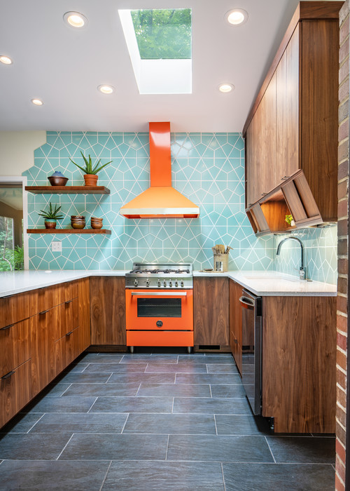
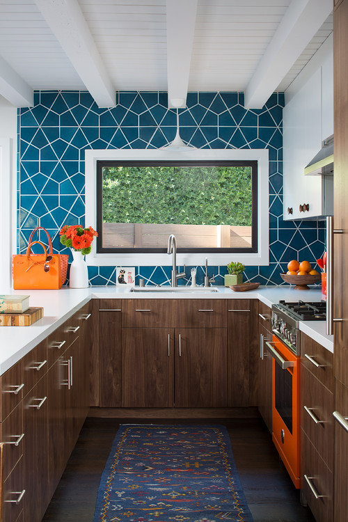
Introduce bright red, orange, or blue sparingly — a feature wall, stools, or a run of upper cabinets makes a bold nod to the 1960s without overwhelming the room.
Working neutrals and wood tones into your space
Pair warm neutrals with mid-toned woods so the area reads cohesive and calm. Matte white, warm gray, or natural wood help hardware and lighting stand out.
Consider colored tiles or a painted pantry door for personality that’s easy to refresh. Test paint and tile swatches at different times of day to check undertones against countertops and flooring.
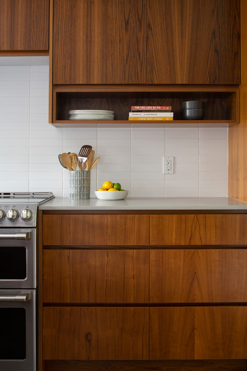
Warm up the woodwork: walnut, teak, oak, and beech
Choosing the right species of wood can instantly define your space. Common options—teak, American black walnut, oak, and beech—each bring a distinct temperature and grain that influence overall design.
Choosing species: American black walnut vs. teak vs. oak
American black walnut offers a rich, chocolate tone and tight grain that reads refined in cabinetry. By contrast, teak shows golden-brown warmth and natural oils that resist moisture and age gracefully.
Oak, especially rift- or quarter-sawn, provides a linear grain that emphasizes clean lines. Beech gives a lighter, subtle grain ideal for a Scandinavian-leaning style.
Finishes and grains that showcase clean lines
Use low-sheen natural oil or matte polyurethane to highlight grain without glare. Match horizontal grain across drawers and doors to reinforce visual rhythm.
Pair warm wood facades with slim brass pulls or integrated finger rails to keep surfaces streamlined. Finally, weigh durability, local availability, and upkeep so the materials suit active daily life in the kitchen.
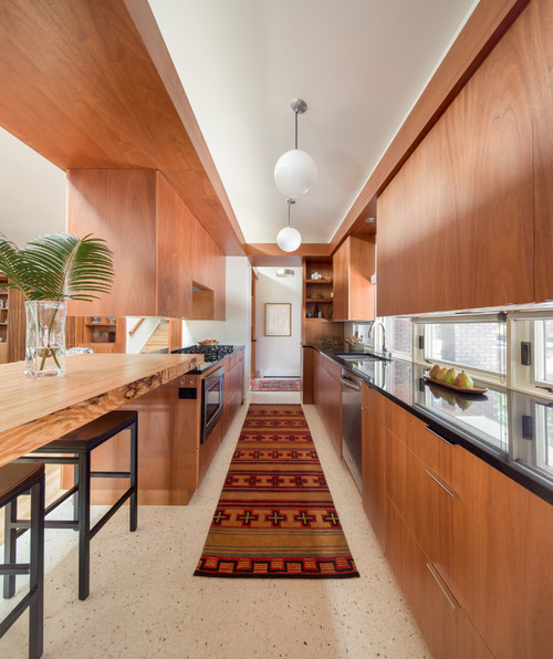
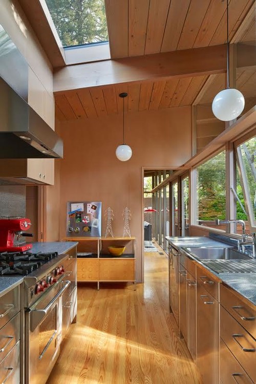
Exposed beams and ceilings: structure as style
When you expose framing, the overhead becomes a deliberate part of the room’s architecture. Visible beams elongate sightlines and add weight without ornament, helping the space feel grounded and purposeful.
Pine planks and the warm, slightly orange cast
Original homes often show pine planks with a warm orange cast that creates a cozy glow. That warmth pairs naturally with walnut and teak cabinets below, making the whole room feel inviting.
Balance is key: keep cabinet fronts restrained and choose a mostly monochromatic backsplash to avoid visual clutter under an active ceiling. Use satin clear coats to preserve the wood’s patina, or light stains to reduce yellowing while honoring the original material.
Integrate beam-mounted track or spot lighting to direct task light without hiding overhead character. Finally, match the tone of the ceiling wood with either contrasting floors and countertops or a deliberate tonal harmony, and always check structural and code requirements before exposing framing or adding loads to beams.
Let your tiles do the talking: subway tile and geometric floors
Tile choices can make a design sing, turning a simple wall or floor into the room’s focal point.
Fresh subway tile takes include varied scale, matte or crackle glazes, and nontraditional orientation like vertical stacks or herringbone. A single run of elongated tiles can add subtle rhythm without overpowering other finishes.
Subway backsplash ideas with a contemporary twist
Frame the cooking zone with a full-height tile backsplash for a crisp, gallery-like backdrop behind the range. Use an opalescent finish for soft sheen or a contrasting grout to define lines and draw the eye.
Honeycomb and geometric floors that echo period geometry
Hexagonal and honeycomb patterns on the floor add movement while keeping color restrained. Pair a patterned floor with quiet counters and cabinetry so the layout stays calm and functional.
Practical notes: choose floor tile with a good slip-resistance rating near sinks and entries. In busy households, durability matters as much as pattern.
Small touches—colored liners, a contrasting grout, or an opalescent tile backsplash behind a stove—let you introduce pattern in controlled doses. These moves keep the space readable and enduring.
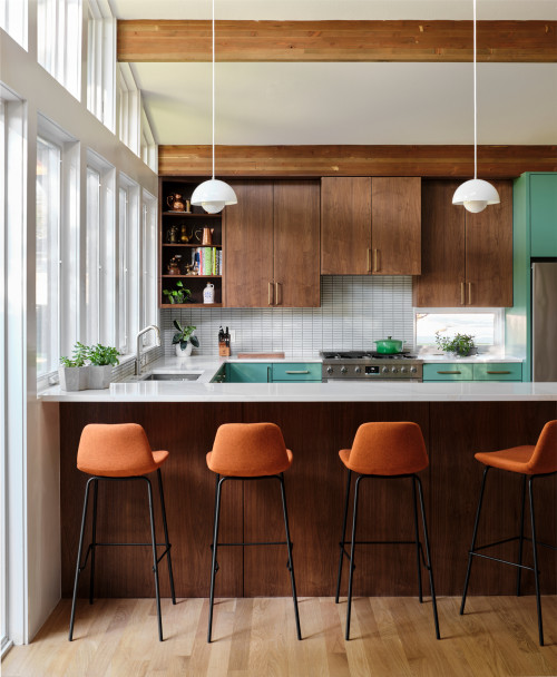
Color blocking cabinetry for instant midcentury punch
Color blocking on cabinets gives a room an immediate graphic lift and costs far less than a gut remodel. A single wall or an island painted in coordinated hues makes the layout read as intentional and fresh.
Designer Angie Hranowsky kept a 1960s kitchen and refreshed the cabinets with carefully matched paint. The result feels faithful to the era while looking current.
Think of color blocking as grouping cabinetry into two or three coordinated runs—warm wood lowers with saturated uppers or crisp neutral tops with a bold island. Period-correct pairs like teal with walnut or mustard with warm white channel a 1960s attitude without kitsch.
Keep changes reversible: limit bold runs to one wall or the island so the rest of the room stays calm and easier to update later.
Use a durable paint system, proper sanding, and priming for a long-lasting, smooth finish. Pair the runs with simple hardware and uninterrupted counters to preserve clean, modern lines. Coordinate lighting and stools to echo cabinet hues for a layered, cohesive space.
Elongate your lines with open shelving and rhythmic details
Extending lines across shelving, island panels, and tile joints draws the eye and simplifies the room’s rhythm. Long, continuous shelves and aligned cabinet reveals visually widen the space and create a calm, graphic flow.
Limit open shelving to frequently used plates, bowls, and clear glass so displays stay tidy and practical. Group items by type and keep the color range narrow to preserve the effect.
Use repetitive slats or paneling on an island to reinforce horizontal lines while adding low-key texture. A rhythmic granite backsplash with consistent joints plays a supporting role rather than competing for attention.
Make sure to add proper wall blocking and choose brackets rated for the expected load so shelves won’t sag over time. Keep accessories minimal—clustered ceramics, wood accents, and glass—so maintenance stays easy and the overall lines remain clean.
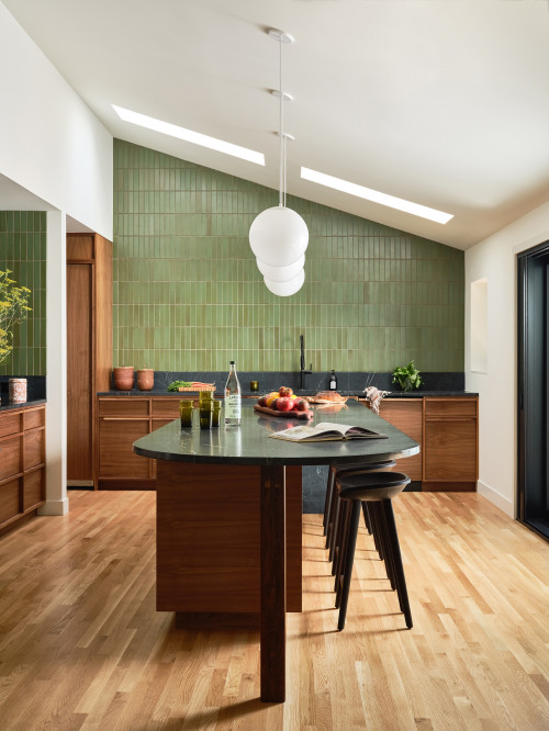
Layered materials for depth: stone, bronze, and textured wood
Pairing cool stone with warm wood and aged metal creates a balanced, lived-in feel. Start by thinking in layers: a textured wall, a mid-tone run of cabinetry, and durable work surfaces that ground the scheme.
Blending slate, quartz, and warm wood for harmony
Encourage mixing materials—green slate or soapstone, bronze accents, and textured walnut—to build warmth and visual hierarchy. A Montana kitchen by Commune shows how green slate, patinated bronze, and walnut paneling read as one coherent composition.
Use a grounding gray quartz for countertops to temper rich woods. Cambria Fieldstone gray quartz is a practical choice that balances floor-to-ceiling wood and stands up to daily use.
Practical tips: add patinated metals in lighting, hardware, or toe-kicks for subtle sheen. Keep the floor quieter when walls and cabinets carry texture so the room feels intentional. Align material transitions at end panels, window lines, or shelf heights to keep the design ordered and durable for high-traffic use.
Brutalist accents meet midcentury modern
When rough-hewn materials meet clean geometries, the result feels deliberate and bold. A Johannesburg project pairs familiar period elements with Brutalist cues to make functional architecture feel sculptural.
Textured stone islands and functional geometry
A chiseled or fluted stone island introduces sculptural weight while honoring midcentury modern proportions. The island reads like a plinth: heavy, tactile, and anchored to the plan.
Cylindrical or boxy vent hoods act as bold forms that state purpose. These shapes read as composed parts of the room rather than decorative afterthoughts.
Balance dense textures with smooth cabinet planes and linear hardware to keep the lines clean. Use honed finishes on the island and the floor to soften glare and highlight form.
Keep the palette restrained so massing and geometry take center stage. Finally, design ergonomic overhangs, integrated power, and layered lighting so the island works for prep, dining, and gathering every day.
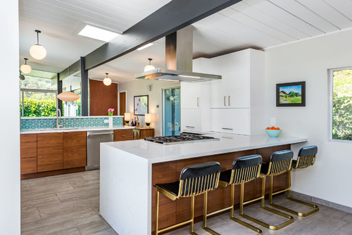
Mid-century modern kitchen islands: form, function, and focal points
An island often becomes the visual anchor that organizes circulation and work zones. It can improve flow, create a clear prep-to-serve workflow, and act as the room’s primary gathering point.
Waterfall edges and multi-level island ideas
Waterfall edges give a crisp, monolithic look that emphasizes horizontal and vertical lines. Brittanicca quartz waterfall-edge islands pair beautifully with brass pendants for an elegant focal point.
Multi-level islands separate cooking and seating without breaking visual cohesion. A raised bar in White Cliff quartz over a Cambria Black lower counter creates a refined color-blocking effect.
Practical features: integrate hidden outlets, underlighting, and slim supports so the mass reads light and stays functional. Keep aisles at 42–48 inches to preserve safety and comfortable circulation.
Quartz countertops that complement midcentury aesthetics
A calm, well-chosen quartz surface ties cabinetry, tile, and lighting into a cohesive composition. It gives the room a refined look while standing up to daily use.
Grounding grays versus crisp whites
Grounding grays like Cambria Fieldstone add warmth and pair beautifully with warm wood tones. Use those when you want a softer, earth-forward palette.
Crisp whites such as White Cliff sharpen contrast and boost light reflectance. Bright white countertops help small spaces feel airier and make accents pop in the room’s color scheme.
Mixing quartz for subtle color-blocking
Try a dark quartz on the island and a light slab on the perimeter to define prep and seating zones. Combinations like Cambria Black with White Cliff work well on multi-level islands.
Keep a simple subway tile backsplash so the grain of the cabinetry and the stone’s veining stay prominent. Matte or low-sheen finishes—Ella Matte edges, for example—cut fingerprints and keep surfaces soft to the eye.
Practical notes: quartz is durable, stain-resistant, and easy to maintain. Align veining with cabinet lines and window axes for a cohesive flow, and pair with restrained tile so the overall scheme reads calm and considered in any kitchen.
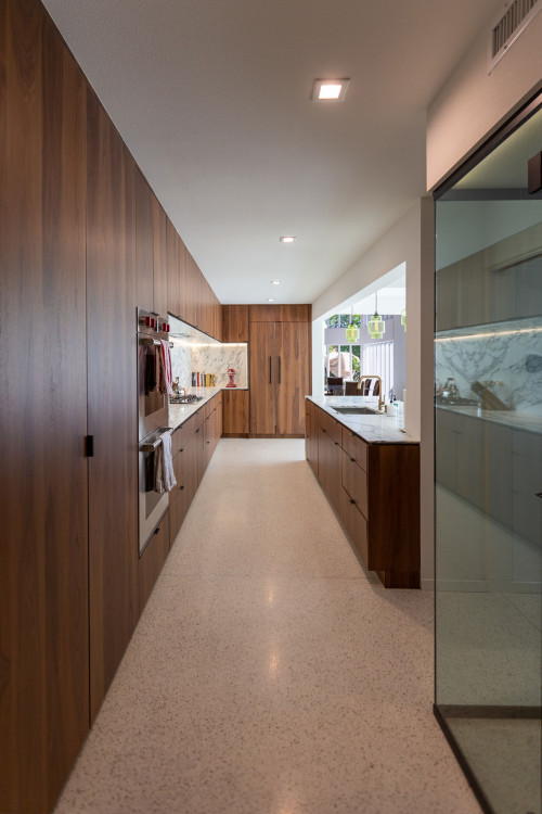
Seamless cabinetry and tucked-away appliances keep sightlines clean and let material choices take center stage.
Panel-ready dishwashers and refrigerators align with cabinet faces to reduce visual breaks. These units let a long run of cabinets read as one continuous surface.
Use appliance garages and integrated microwave drawers to free counter space. They hide daily clutter while keeping essentials within reach.
Full-height pantry cabinets with pullout shelves, bins, and tray dividers concentrate storage. A single tall run simplifies workflow for prep, service, and cleanup.
Select flat-panel doors with integrated pulls or edge profiles for an era-authentic façade. Slim finger grooves and concealed hinges preserve clean lines.
Plan ventilation that minimizes bulk — concealed hoods or slim cylinder vents work well depending on the aesthetic direction. Coordinate finish temperatures, pairing warm wood with brushed brass or blackened hardware to keep the suite coherent.
Thoughtful design keeps function invisible without sacrificing performance, so the room stays calm and highly usable every day.
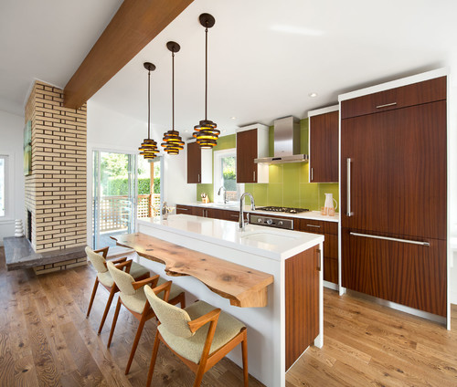
Lighting the look: pendants, brass details, and sculptural forms
A thoughtful lighting plan turns fixtures into architectural accents as much as sources of light. Use layers—ambient, task, and accent—to flatter materials and support cooking and gathering.
Statement pendants over island and dining nooks
Place sculptural pendants above the island and any dining nook to anchor zones and echo era-inspired forms. Geometric brass chandeliers complement white quartz and blonde brick walls and beams for a midcentury-meets-contemporary expression.
Coordinate finishes by matching brass or bronze pendants with hardware and faucets. This creates subtle continuity without rigidly overmatching fixtures.
Include wall-washers to reveal texture on wood or brick walls and add depth. Maintain correct pendant spacing and height so sightlines and conversation across the island remain clear.
Finally, use dimmers and warm color temperatures to enhance the cozy glow of wood and support evening entertaining. Thoughtful lighting ties the architecture, materials, and overall style together into a cohesive whole.
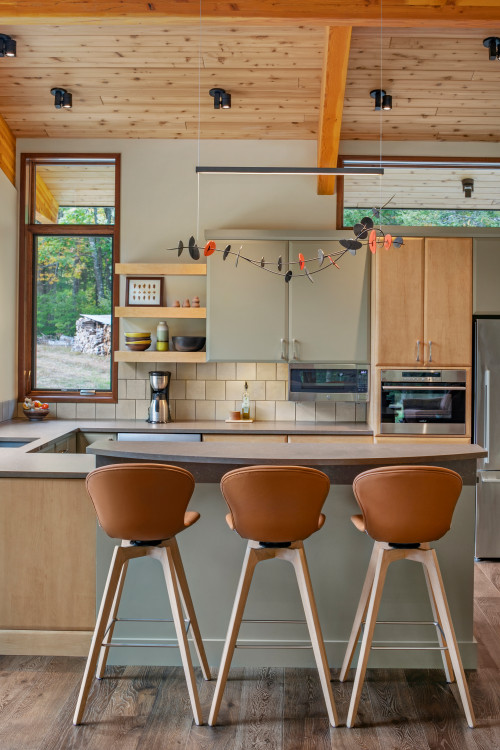
A restrained, light-filled palette can unite Scandinavian calm with the era’s functional clarity. Blonde wood, simple lines, and pale, nature-derived hues set a calm foundation for a modern home.
White or pale quartz countertops amplify light and keep the palette crisp against soft wood tones and blonde brick walls. Pair that with a geometric brass chandelier to add sculptural interest without weight.
Blonde woods, simple lines, and understated color
Use slab fronts and minimal hardware to echo both traditions’ love of clarity and craft. Keep walls and millwork light and neutral to make the room feel larger and more coherent.
Layer warmth through textiles, stools, and open-shelf accents. Choose wipeable finishes, durable floors, and concealed storage so the space performs like well-designed modern kitchens in everyday life.
Practical note: this blend supports a lived-in look that reads refined. It balances sculptural lighting and pale surfaces with functional solutions for a busy kitchen while honoring midcentury modern style and modern style principles.
Nooks, seating, and everyday livability
A cozy eating nook turns everyday routines into small rituals and anchors the room’s social life.
Booth-style breakfast nooks are space-efficient and invite daily use—from quick coffee to evening cards and cocktails. They make corners feel intentional without needing extra furniture.
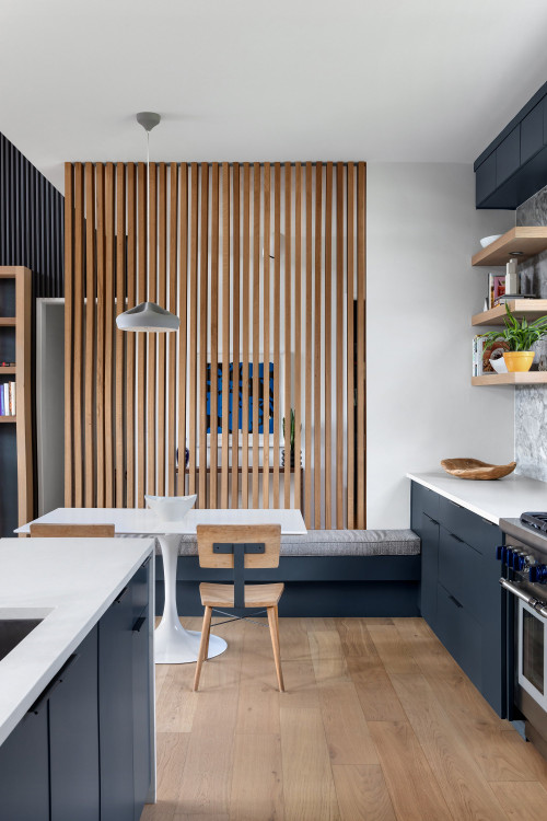
Breakfast booths, wire-backed stools, and vintage-inspired pieces
Wire-backed stools add sculptural lightness and a direct link to industrial-era design while keeping sightlines open. Pair them with a durable island overhang for comfortable seating.
Balance vintage finds with modern performance fabrics and wipeable surfaces so family life stays easy. Protect the floor in high-use zones with runners and add cushioned pads near the sink for standing comfort.
Practical notes: keep pathways to appliances clear and match seating heights to counters for ergonomic ease. Add small display moments—vintage glass or ceramics—without crowding surfaces so the area stays both useful and full of character. This approach keeps the home welcoming and true to the room’s overall style.
Conclusion
The best projects marry durable finishes with clear sightlines so the space works hard and looks calm.
Balance clean lines, streamlined cabinets, and considered materials to keep function and form in step. Choose warm wood—walnut, teak, oak, or beech—and honor any original beams or ceiling details you can preserve.
Use color from earth tones to 1960s primaries, and let tile and a thoughtful backsplash add pattern without crowding. Subway tile set in fresh layouts, grout choices, and tile backsplashes help tie walls to counters and the island.
Pick quartz countertops for durability, panel appliances to keep sightlines, and align floors, island, and counters so every surface supports workflow and visual rhythm. Adapt these ideas to your home or apartment—scale materials, cabinetry, and lighting to fit your plan.
Next steps: gather kitchen ideas, shortlist quartz countertops, map a kitchen island layout, and refine tile selections with warm wood accents to complete the vision.
Frequently Asked Questions
More Mid-century Modern Style Decor
- Mid-Century Modern Style: The Complete Guide
- Mid-Century Modern Style Bedroom: Iconic Sleep Sanctuary
- Mid-Century Modern Style Living Room: Timeless Elegance